Much has been made, especially amongst the climate change deniers, of the recovery of Arctic ice in 2013 when compared with 2012. The ice extent (area covered) in the middle of September 2013 is approximately 60% greater than the ice extent of 2012. A few comments are in order.
Firstly, this a recovery from a very low level. This is 60% above the totally unexpected (at least by climate change deniers), exceedingly low ice extent of 2012.
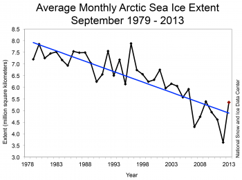
The second point is that even though this was a big increase above this low level, if you look at the trend line (linear regression) in the following graph, you see that the ice extent of 2013 is only just above the trend line. The September ice extent since 1978 has been decreasing at 13.7% every 10 years and the value for 2013 is very much in keeping with this trend. Looked at another way, the ice extent for 2009 which you will see is just above the trend line was 5.63 million square km while for 2013 it was 5.35 million square km; a slight decrease. There have also being other "recovery" years, notably from 1995 to 1996 without any lasting effect. Looked at still another way, if this was really a recovery of the ice, you would expect the 2013 dot to be as far above the trend line as the 2012 dot was below it.
Firstly, this a recovery from a very low level. This is 60% above the totally unexpected (at least by climate change deniers), exceedingly low ice extent of 2012.
The second point is that even though this was a big increase above this low level, if you look at the trend line (linear regression) in the following graph, you see that the ice extent of 2013 is only just above the trend line. The September ice extent since 1978 has been decreasing at 13.7% every 10 years and the value for 2013 is very much in keeping with this trend. Looked at another way, the ice extent for 2009 which you will see is just above the trend line was 5.63 million square km while for 2013 it was 5.35 million square km; a slight decrease. There have also being other "recovery" years, notably from 1995 to 1996 without any lasting effect. Looked at still another way, if this was really a recovery of the ice, you would expect the 2013 dot to be as far above the trend line as the 2012 dot was below it.
September 2013 compared to previous years

Figure 3. Monthly September ice extent for 1979 to 2013 shows a decline of 13.7% per decade.
Credit: National Snow and Ice Data Center
Credit: National Snow and Ice Data Center
Going out on a limb here, it would appear, looking by eye, that a downward curving, exponential line would fit the data points better than a linear regression (straight line). In which case we can expect, in the coming years, some very low ice extents in September, rivalling and exceeding the 2012 values. In other words, ice melt is accelerating. Even if the decrease in ice extent only continues as per the linear trend line, the Arctic will be ice free in a couple of decades. If ice decrease is actually accelerating, we only have a few years to go.
Note that here we are talking about the ice extent in the middle of September when it is its lowest. Following a zero ice extent on September, with small ups and downs, the ice free period will increase year by year.
If you want to see what ice volume has been doing click here.
One further point. In a previous blog, I described how Coriolis tends to concentrate surface water and ice into the centre of high pressure (sunny weather) systems while low pressure systems (cloudy weather) spread things out that are floating on the surface. 2013 has had predominately low pressure systems and the ice extent could, to some extent be an artifice. NSIDC measures ice coverage above 15% as complete ice coverage so spread out ice would appear as more ice even if it is not. But let's say, for the sake of the argument that the 60% increase in ice extent is real.
The check on this should be the results from ESA (European Space Agency) satellite, Cryosat2. By measuring free board (the height of the ice above the water), it can calculate the volume of ice in the Arctic. As has often been mentioned, ice volume is a better measure of the true amount of ice floating on the Arctic ocean than ice extent. It may be that I just can't find the data but if not, I would urge the ESA to release the information. Then we could see if the ice really has increased 60% from Sept 2012 to Sept 2013.
ps. Gaia has many mechanisms to try to keep the temperature constant on the earth (sorry about the anthropomorphism) We apparently are seeing one of them here. With warmer Arctic water, air rises and gives rise to clouds which shade the Arctic ocean and reduce ice melt. I wish Gaia luck in the attempt. We are pushing her pretty hard.
This is one of the best graphs I have seen. It shows that this year is only just a line width above the 2010 to the present average. Not much of a recovery. Sorry about the size. Click on the image to see a decent sized version.
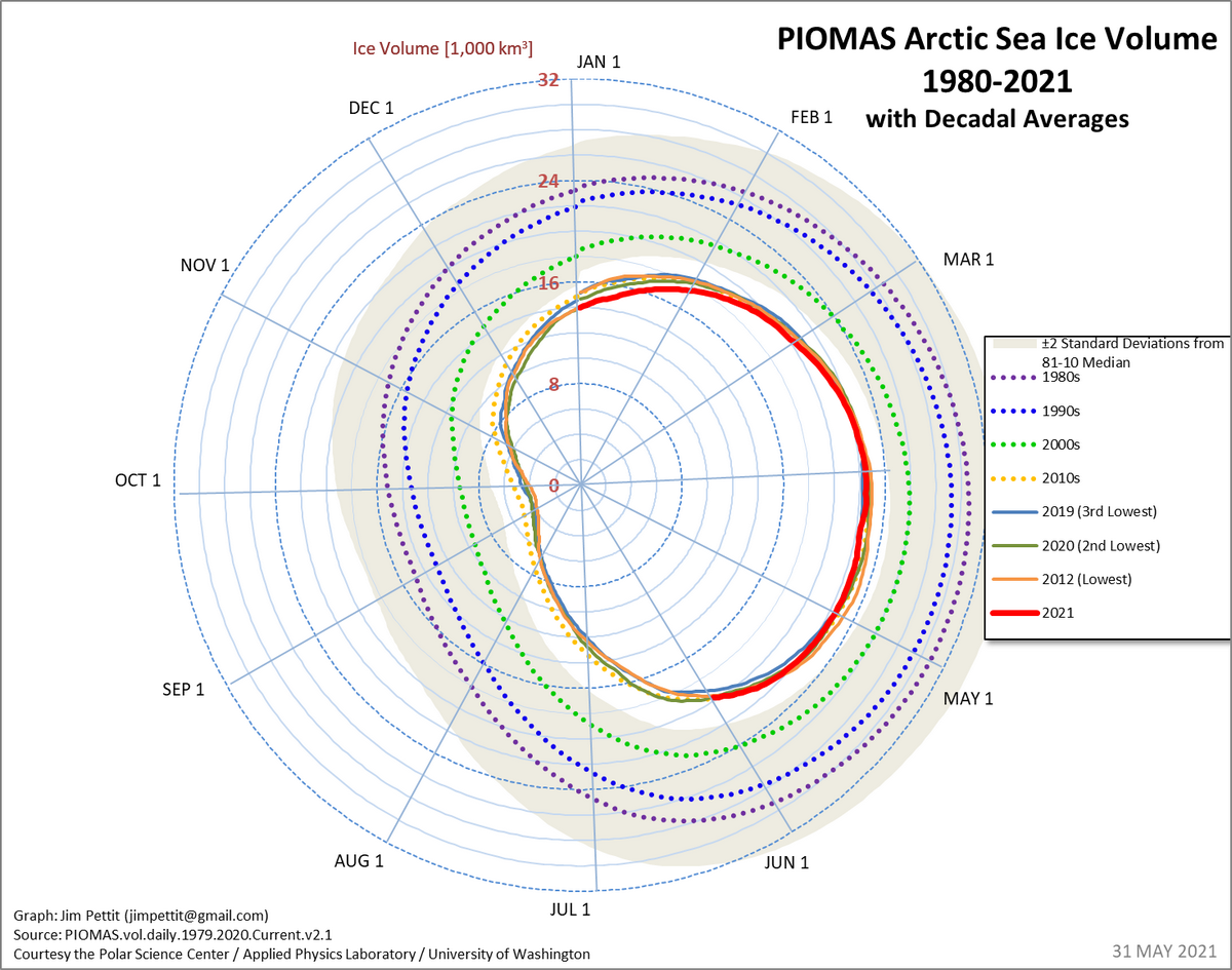
You will notice that the space between successive decade averages gets wider and wider. In other words, ice melt is not increasing linearly but is accelerating.
Just an amusing thought to finish with. There will come a year when the ice extent is zero. The year after that, there is likely to be a recovery. Look at the graph. It is a ever decreasing saw tooth pattern. On the year after the zero ice extent, no matter what the level of the recovery, the climate change deniers will be able to claim an infinite increase in ice extent.
Note that here we are talking about the ice extent in the middle of September when it is its lowest. Following a zero ice extent on September, with small ups and downs, the ice free period will increase year by year.
If you want to see what ice volume has been doing click here.
One further point. In a previous blog, I described how Coriolis tends to concentrate surface water and ice into the centre of high pressure (sunny weather) systems while low pressure systems (cloudy weather) spread things out that are floating on the surface. 2013 has had predominately low pressure systems and the ice extent could, to some extent be an artifice. NSIDC measures ice coverage above 15% as complete ice coverage so spread out ice would appear as more ice even if it is not. But let's say, for the sake of the argument that the 60% increase in ice extent is real.
The check on this should be the results from ESA (European Space Agency) satellite, Cryosat2. By measuring free board (the height of the ice above the water), it can calculate the volume of ice in the Arctic. As has often been mentioned, ice volume is a better measure of the true amount of ice floating on the Arctic ocean than ice extent. It may be that I just can't find the data but if not, I would urge the ESA to release the information. Then we could see if the ice really has increased 60% from Sept 2012 to Sept 2013.
ps. Gaia has many mechanisms to try to keep the temperature constant on the earth (sorry about the anthropomorphism) We apparently are seeing one of them here. With warmer Arctic water, air rises and gives rise to clouds which shade the Arctic ocean and reduce ice melt. I wish Gaia luck in the attempt. We are pushing her pretty hard.
This is one of the best graphs I have seen. It shows that this year is only just a line width above the 2010 to the present average. Not much of a recovery. Sorry about the size. Click on the image to see a decent sized version.
You will notice that the space between successive decade averages gets wider and wider. In other words, ice melt is not increasing linearly but is accelerating.
Just an amusing thought to finish with. There will come a year when the ice extent is zero. The year after that, there is likely to be a recovery. Look at the graph. It is a ever decreasing saw tooth pattern. On the year after the zero ice extent, no matter what the level of the recovery, the climate change deniers will be able to claim an infinite increase in ice extent.
No comments:
Post a Comment